

Beyond Roy G. Biv
Fun with color
Since the weather here has got a bit of a spring in its step lately, I thought I’d tackle a colorful topic, which is to say: color. A lot of designers seem to get defensive or intimidated when dealing with color, and I get it — people can get very emotional when discussing color, and there are far too many “I’ll know the right shade of blue when I see it” discussions that can drag on for hours. “This one?” “Not quite…” “How about this?” “No, that’s totally wrong.” “Darker or lighter?” ad nauseam. People care about color.
Color can connect deeply to emotions, cultural baggage, identity, brand marketing, complex color theory, and more, and conversations around color can get complicated when trying to pin down a specific shade beyond the language of the basic box of 100 crayons we learned as kids. And as digital designers we then in the end have to somehow reduce it all to a set of hex codes. How do we pack all that in?
People sometimes find it odd that, as a designer, I can’t answer the question “What’s your favorite color?” To me that question makes about as much sense as asking me what my favorite note is. C♯? E♭? But a chord — a set of relationships between notes — is much more eloquent and evocative. Colors, to me, operate in a similar way. A particular combination in a specific context has a depth and meaning that an abstract individual color really doesn’t.
One of the first steps to better understanding, discussing, and working with color is to figure out a few color models. You have likely heard of RGB (Red, Green, Blue) colors (the primary colors used by computer monitors to mix up all the other colors we see on them) and you may have also heard of the print standard CMYK (Cyan, Magenta, Yellow, blacK (B could be mistaken for blue so K is used instead)), but I think the most helpful color model is HSB — Hue, Saturation, Brightness.
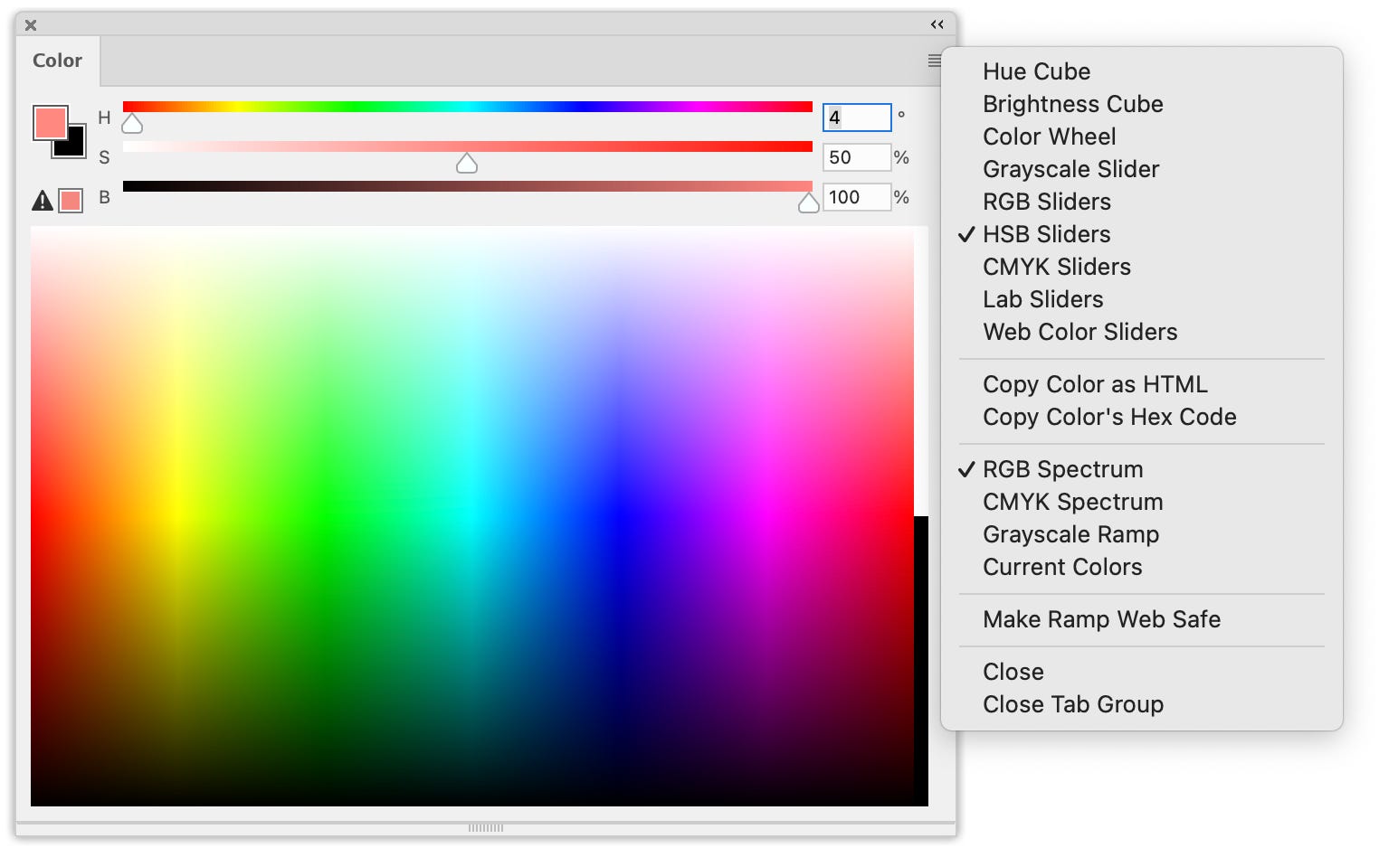
I usually rely on HSB because I think it comes closest to matching most people’s mental models of how color works. Hue reflects the most basic names we give colors: blue vs. red, orange vs. purple, etc. and is organized along a rainbow-ish spectrum from red through violet. Saturation represents how much white is mixed in, and brightness how much black.
For finding a good set of colors it can be helpful to hold one or two of those variables (hue, saturation, and brightness) steady while changing the other one or two, which makes the relationships among the colors a bit more obvious (for example they all share the same hue, though the saturation and brightness vary). When working on color with non-designers, sharing this color language can help make conversations more productive.
A few other things to keep in mind when you work with color:
It’s not just the combination of colors, it’s also the proportions that change the overall effect. So when looking for a color combination, be sure to indicate that. For example instead of just using a series of same-sized boxes for each color, scale them to give some idea of which colors will be most prevalent, and which rarely used. For example, as a starting point for more detailed color design, the bottom image here is much more useful than the top:
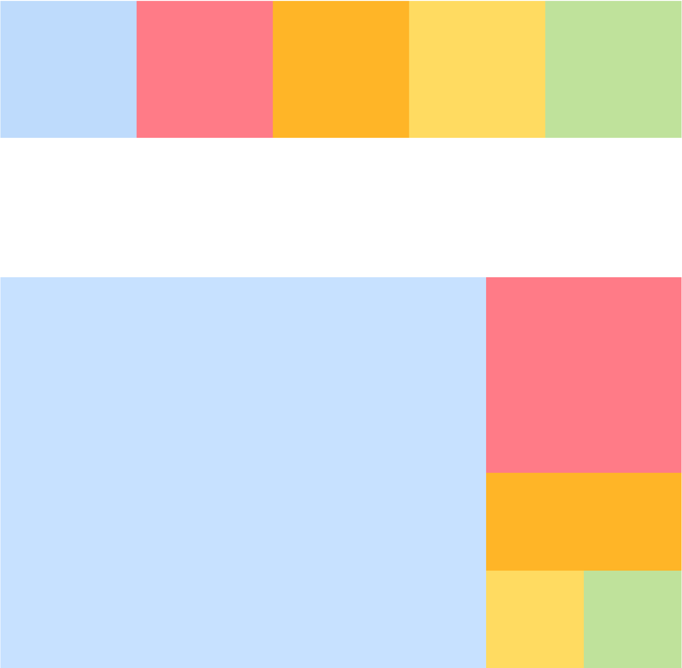
At the top equally-sized boxes don’t give an accurate impression of how the colors are likely to be used. Below by scaling the boxes start to give a rough idea of proportions, the relationships between the colors become clearer. Color perception varies widely, especially in digital design. You can’t control the screen, the lighting, the surrounding colors, or even exactly how the person’s eyes work, and they all affect how colors are perceived. So don’t get lost in the weeds, it’s not worth it. This is where focusing on combinations (the chords) rather than exact individual colors (the notes) helps a lot — the relationships between the colors should hold up better across changing contexts than the precise individual colors.
Of course accessibility is another big consideration with the use of colors. Making sure designs make sense to people with less ability to distinguish hues is one aspect, but legibility can be diminished even for people with full color perception — are lines and text clearly discernable against the background? It depends on the color combination. Black text or lines on a white background is generally very clear, but once you start adding other colors in there legibility decreases. There are a lot of considerations here, so I’ll leave this topic for another time.
Color can absolutely contribute to hierarchy, or how people perceive the relative importance of elements, as well as connections between those elements. Again the HSB model helps a lot here, another reason I like it.
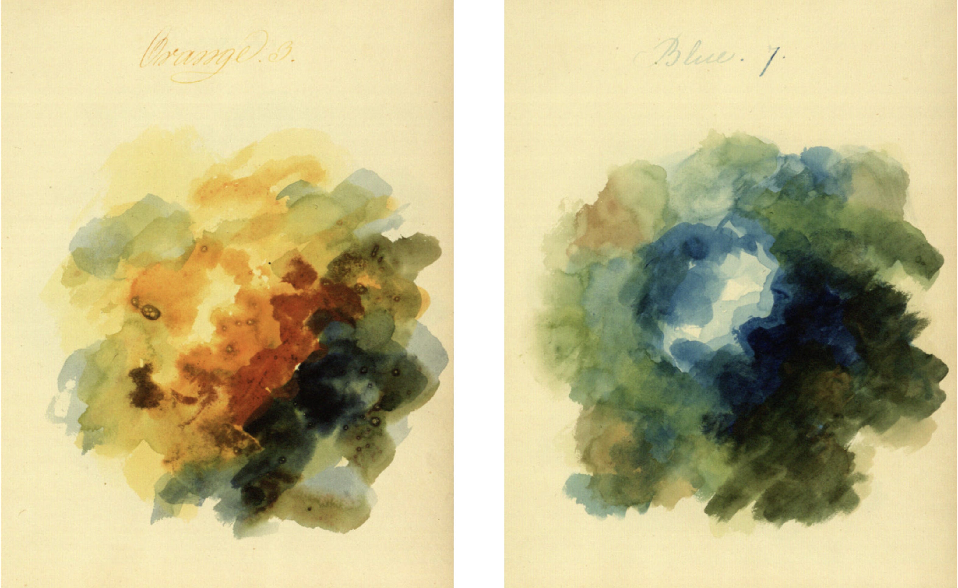
If you go down the (fun!) color theory rabbit hole, remember that color mixing behaves very differently with light or additive colors (like a monitor) versus pigment or subtractive colors (like paint), and a lot of color theory was developed for artists or print designers using the latter. There are a lot of quirks specific to how color works in monitors (like the color orange!), so just keep that in mind.

Most importantly, remember that as long as you have a good mental model of how color works and a solid understanding of how it affects accessibility and the relationships among the elements on a page/screen/etc., there’s a lot of room to have fun 🌈